3D Modeling and Look Development

SCAD x NYC Collab
The SANM 560 class is designed to simulate the experience of a professional team project by challenging students to create a high-quality commercial incorporating VFX. Students work in groups of 5 to develop their own concept and bring it to life within a 10-week period with the help and feedback of industry mentors.
Entry 9: Mar 19th, 2026
After 10 incredible weeks, our time on this project is coming to an end. We were incredibly lucky to have our mentors visit us in Savannah on March 3rd for one of our last rounds of critique and discuss the industry and their respective companies with us. The bulk of our notes were on things we decided to fix in comp, so my biggest priority going into week 10 was starting on breakdowns and helping Emily make our project poster.
Team Nuage Breakdown
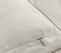
Alongside our team breakdown, we were also each tasked with creating our own individual breakdowns for our contributions. I updated the bed asset turntable and material quilt (that --admittedly-- I haven't touched since week 4) and took screenshots of each material's shader network.
Individual Breakdown -- Look Dev.
Shader Networks (not entire)

Sheets Shader Network (above)

Comforter Shader Network (above)

Throw Blanket Shader Network (above)

Headboard Shader Network (above)

Nightstand Gold Shader Network (above)

Nightstand Wood Shader Network (above)
It's hard to believe this project is already over. I've had a blast working with my team and am so grateful for their hard work and how willing they were to step up and help whenever somebody was stuck or needed help to meet a deadline. Huge thanks as well to Professor Gaynor and Professor Fowler for their advice and running the show, as well as all our mentors who took the time out of their schedule each week to see or progress and help steer us in the right direction.
I've made some incredible connections and can't wait to see what new projects my team members will work on in the future. #teamnuageforever
Entry 8: Mar 1st, 2026
Last week, FX artist Mia changed the camera angle for shot 1 and I had to revise lighting to match the new angle. The key light needed to be repositioned since the portion of the weave geometry it was lighting was no longer centered when looking through the new camera, causing the colors to be duller/darker. While realigning the key light, I also slightly increased the intensity of the key light and increased the whiteness of the thread material since the mentors had given feedback that the off-white/cream we were using didn't match the sheet color for the rest of our shots.

Shot 1 prior to changes (above)

Shot 1 w/t adjusted light position (above)

Shot 1 w/t slightly increased light intensity (above)

Shot 1 w/t whiter sheet material (above)
For Shot 6, I made further minor adjustments to the mattress material and worked with Emily to replace the wall art in the background based off of the feedback we received last week from the mentors. A mask for the seam and subtle corner wrinkles was created in Substance Painter and some subtle noise was added to the bump map to add slight imperfection to the mattress shape.

Shot 6 before changes (above)

Shot 6 w/t seam from Substance Painter (above)

Shot 6 w/t color corrected seam for higher contrast/visibility (above)

Shot 6 w/t seam softened and subtle noise added to bump (above)
For Shot 2, I troubleshot an issue that arose after FX artist Nidhi made some adjustments to the sheet geometry where the underside of the sheet was overlit. I looked at each light individually and determined it wasn't an issue coming from a particular light hitting the underside of the blanket. I quickly figured out that Nidhi's adjustments to the sheet thickness had thrown off the SSS scale, and fixed the issue by lowering it.

Shot 2 w/t underside of sheet overlit (fill light only)

Shot 2 w/t underside of sheet overlit (HDRI light only)

Shot 2 w/t underside of SSS scale fixed and all lights turned back on
After solving this issue, I adjusted the position and intensity of the key light based on mentor feedback that the rim of the blanket had been lit too sharply. To make up for a slight loss in light due to the key light adjustments, I also slightly increased the fill light intensity.

Shot 2 w/t repositioned key light and slightly increased fill light
Entry 7: Feb 21st, 2026
On Tuesday, my team discussed changing the font of our fake brand logo and I took a break from Look Dev to brainstorm possible logos. After sharing different font options with my team, we unanimously agreed to go with Cinzel Decorative in a lighter cream color as it fit the luxury, neutral aesthetic best.

Original (Placeholder) Logo (left) and final logo (right)

Alternate Logo Concepts
Following the logo redesign, my next priority was look development for shot 2, which FX artist Nidhi had made drastic changes and improvements to in the previous week. The geometry and camera were so different from the previous version that the lighting needed to be restarted and materials had to be reassigned and mildly adjusted.

Shot 2 w/t reassigned materials (above)

Shot 2 w/t sheet weave scaled down and light moved to increase shadows/contrast (above)

Shot 2 w/t warmed HDRI and stronger rim light (above)
The new geometry for the sheet was thicker than the previous, so the scale of the SSS needed to be adjusted accordingly to achieve the same softness that the previous sheet had had. Based on peer feedback, the bump height of the sheet material was also decreased to look softer.

Shot 2 w/t higher SSS on sheet material (above)

Shot 2 w/t higher SSS and less bump on sheet material (above)
Over the weekend, I worked with Emily to make changed to the mattress in shot 6 based off mentor feedback that the SSS and specularity was making it look more like a bar of soap than a mattress. We experimented with sharpening the edges/corners of the mattress and agreed to add a seam and some subtle wrinkles/imperfections within the textures.


Shot 6 w/t small SSS and roughness adjustments (above)
Shot 6 w/t sharper corners and less SSS (above) -- corners now too sharp

Shot 6 w/t final mattress geometry (above)
Goals going into Week 8:
- Continue improving mattress in shot 6
- Improve lighting in Shot 1 and make thread material whiter
- Resolve UV issue on throw blanket in shot 7
- Change painting on wall based on mentor feedback
Entry 6: Feb 14th, 2026
This week, my team has made several big strides. On February 8th, we had out long-await live-action shoot, and our compositor Zach will be focusing heavily on the live-action integration this week. We've agreed as a team that if the live-action portion of our project isn't looking good by Monday, it will be scrapped, so this is a very "make-or-break" moment. FX artist Nidhi has also made huge changes and improvements to the animation and camera movement in shot 2, which has set us a little behind for lighting and look dev.


Shot 1 with updated weave sim and less light intensity
Shot 1 updates w/t test vignette made in NukeX
I received the updated Shot 1 animation from FX artist Mia, and moved it into my lighting file for shot 1. Mia's changes to the thread thickness helped add back contrast and definition to the shot. For the first pass of relighting, I lowered the keylight inensity to fix overexposure issues the last version had had and tested out adding a vignette in post. While my team and I liked the vignette look, this version was now too dark and didn't match our other shots.

Throw blanket - initial material
Over the weekend, I updated materials for shots 6 and 7. For shot 7, I specifically focused on the throw blanket, which my team had given me some critique on (specifically on the roughness/highlights). I started with tweaking the tiling and bump to make the waffle texture more apparent, then resolved the specular issues.

Throw blanket - decreased tiling + increased bump

Throw blanket - roughness increased + sheen color lowered slightly
I noticed the squares of the waffle pattern were looking stretched/rectangular in many places, and made some slight changes to the UVs to try and fix it. This didn't help as much as I wanted, so I stretched the waffle pattern to make the pattern appear more square on the actual mesh. Finally, I fine-tuned the colors of the base, specular, and sheen colors.

Throw blanket - UV tweaks + stretched waffle texture

Throw blanket FINAL - Extra bump faked w/t base color + beige tinted specular color
For shot 6, my primary goal was just updating all the materials in the scene. Due to issues running out of space in my team's shared drive last week, I hadn't been able to access the shot 06 Maya file and most of the materials in the scene were outdated materials from Week 4.

Shot 06 with outdated materials (comforter geo hidden)

Shot 06 with latest materials (notably, mattress cover, curtains, and carpet)
Furthermore, me and Emily had updated the Window/backwall geometry and added a painting in Shot 7, so I moved those assets into our Shot 6 file. Emily and Zach had created image sequences of trees using Unreal to add more dynamic shadows to the scene, so I also imported the planes w/t the tree image sequences into the Shot 6 scene. and re-rendered it.
Shot 06 WIP render, pre-compositing
Entry 5: Feb 8th, 2026
After the mentor critique on Feb 3rd, I knew that I needed to return more of my focus back to the materials. Most of our fabrics were still not looking soft or elegant and with shot 2 now being lit in Karma, I would also need to recreate the gold thread and sheet fabric materials in Karma. My main priority was the look of our final shot though, and adding back materials and assets that had been removed/not yet updated in the scene file.

Shot 7 prior to adjustments, w/t Throw Blanket Mat. reassigned
After repathing a few materials, I made some lighting adjustments as I felt the blue was too strong and I noticed blue light spilling on the floor and right side of the bed. I discovered the bed spill was due to the comforter geometry clipping though the ground plane and extruded the floor downward to fix the issue. Color and Intensity of the skydome were also decreased.

Shot 7 w/t skydome intensity decreased and comforter spill resolved (above)

Shot 7 w/t bedside lamps and decorative vase re-added to scene
With the lighting fixed, I then began working on the SSS values for the comforter, lampshade, and blankets. Previously, they were too low and the scales were not set up properly. To test the lampshade SSS, I also threw in a temporary point light to act as a lightbulb.

Shot 7 w/t increase SSS on soft materials (Still a WIP)
I was able to get the updated bed sculpt from Emily on Wednesday and continued forward with my edits using the updated geometry. Just having better geometry with wrinkles and a more fine-tuned shape did wonders for the look of the scene.

Shot 7 updated bed sculpt
I was able to get the updated bed sculpt from Emily on Wednesday and continued forward with my edits using the updated geometry. Just having better geometry with wrinkles and a more fine-tuned shape did wonders for the look of the scene. While working on the curtain, I realized the SSS wasn't showing up much because the curtain was entirely over the wall, so I extended the window to allow light to hit the curtain.


Curtain w/o SSS (top left) and curtain with SSS (top right) while over the wall

Shot 7 w/t SSS on curtain and extended window

Shot 7 w/t curtain color slightly redder and painting added to wall.
While I was overall satisfied with the adjustments I made during the week, I know I still need to work on the carpet and bedding more. I discovered while working that increasing the SSS was killing my bump maps, which I believe is partially why the bedding and carpet look so flat and fake.
Over the weekend, I shifted focus to the golden embroidery on the pillow and sheets edges. While my team initially planned to add these details with texture maps, overlapping UV issues arose when exporting from Houdini to Maya. I attempted to re-UV the meshes in Maya and Nidhi tried re-setting up and exporting our simmed geometry, but these attempted solutions either wouldn't hold or would 'overwrite' the geometry's animation.

Laid out UVs for simulated sheet in Maya UV port (for Shot 4)

Same mesh and UVs functioning in viewport (right) but breaking in Arnold Renderer (left)
Ultimately, we had to pivot and I created a seperate material for the edge embroidery that we will assign to individual faces along the edges. While this will create a hard transition between the embroidery and sheets, the embroidery isn't the focal point of these shots and the animation will hide the sharp edge a little. We need to keep moving forward and focus our attention on other more 'center-stage' details.

Shot 4 w/t pillows w/t golden edge embroidery.
Goals going into Week 6:
- Further improvements to shot 7 (hero shot)
- Make lighting and material adjustments to Shot 1, with Mia's updated weaving sim
- Begin working on Shot 6; materials need to be reassigned and some geometry is outdated.
Entry 4: Feb 2nd, 2026
During week 4, my focus mainly shifted to supporting Emily in lighting instead of working on materials. However, I did restart the shader for the carpet and finished textures for the decorative vase in our bedroom scene. The updated vase material has color variations created with masks created in Substance Painter, and has been rescaled to fit the vase UVs properly.

Tectured Vase Asset and Reference Photos
For lighting, I was assigned shots 1 and 2. Initially, all lighting was to be done in Maya Arnold, but due to how heavy the weave sim files are, we pivoted and opted to render shot 1 in Houdini Karma. The file for shot 1 already had some base lighting, but was over-lit and lacked visual clarity because there was almost no contrast or shadows. My primary goal for the first lighting passes was to restore the darker values, referencing the lighting from one of our FX references which the mentors and my team had really liked.

Original lighting of Shot 1, before I started re-lighting it (above) and lighting reference by Daniel Mille (below)

Pretty quickly, I ran into the issue that it was hard to achieve the darker shadows and contrast in Mille's lighting example without straying too far from the primarily white, cream and beige color palette of our project. The first passes were an improvement, but simultaneously felt too dark/moody and too flat. The beige background color my team wanted was too similar to the shadows of the off-white weave, making it difficult to see the strings at the top of the composition clearly.

Shot 1, Lighting Pass 1, Option 1 -- (the favorite)

Shot 1, Lighting Pass 1, Option 2

Shot 1, Lighting Pass 1, Option 3
In my next lighting pass, I resolved to try and match our brand identity/color palette more and fix the flatness issue by moving the positions of the lights to be less overhead. After experimenting with different colors for the background plane, I settled on a deeper brown color as a compromise between the beige and black, which again improved but didn't entirely solve our lighting/visual definition issues.

Later one, Emily offered to assist me with the lighting of shot 1 and we met up and looked over our lighting/FX references and the shot 1 file and lighting set-up I'd built more scrutinously. We recognized and agreed that part of the issue could be the string count and thickness in our simulation being noticeably higher than those in our FX references, providing less of a view of the background and crowding the screen. We will be discussing our observations and possible FX adjustments with Mia tomorrow.
Entry 3: Sun, Jan 25th, 2026
By Thursday, I had recovered from being sick and was able to work with my team in-person again. During class time, I worked with Prof. Gaynor to solve the lighting issues in the Look Dev. rig and my team decided to drop Houdini and use Arnold for all renders. The fabric swatches that Nidhi ordered in Week 1 had arrived over the weekend and Nidhi gave them to me for reference. Using a microscopic camera Prof. Gaynor loaned to us, Zach took a bunch of close-up photos of the fabric weaves for me, which I decided I wanted to try and convert into tileable texture maps using Adobe Firefly and Substance Designer.

Original Microscopic Photo taken by Zach Malich (above)

Photo made tileable and color adjusted using Photoshop and Firefly (above)

Material generated by Substance Sample (above) and final fabric material rescaled in Maya (below)


The texture maps generated by Substance Designer were fairly successful, and I only had to do some slight post-adjustments to return some of the saturation/warmth and decrease the Ambient Occlusion to create a good fabric shader.

Second fabric shader created using same method (above and below)

_edited.jpg)
Some further tweaking was done to the colors and roughness levels after being brought into Maya. After the two Substance Surface materials were imported, I went through all of the bedding materials to do a second pass and add sheen and subsurface scattering. Bedding materials were then added to the current (WIP) bed asset in a turntable to test the materials together.

Goals going into Week 4:
- Further refinement of materials based off critique.
- Adjust lighting of Look Dev. Rig so everything is less grey.
- Further tests on materials on assets with Emily's lighting.
Entry 2: Tues, Jan 20th, 2026
Following our initial pitch to the mentors, my team made some major changes to our concept. We ditched the pink and purple cloud environment to focus on highlighting our product and the delicacy of the fabric weaving. After further brand research, we also decided to change our color palette to warm, neutral colors to match Boll & Branch's brand identity. I added curtains and a decorative vase (sourced from TurboSquid and Fab) to our 3D room scene and explored several different options for the room layout.

Variations in room design (primary adjustments were to how close window was and position of the vase and ottomans)

New color palette boards
Using the new color palettes I created and reference photos from Pinterest that matched the colors/aesthetic of our commercial, I created a 10-image style library for Vizcom. It took Vizcom around 25 minutes to train itself based on the 10 images, but using a style library yielded much better results when trying to generate concept images that accurately matched the aesthetic of our concept.

Before creating style library-- trying to use Mix node to create an in-style render (above)


After creating style library-- using style library and a prompt (above)
Iterations to images creating using style library (below)
Over the weekend, I moved on from AI concept image generation and began development of our shaders. I composed a list of all necessary materials, built a Look Dev. rig, and worked with Emily to gather the rest of our look dev. references. We will be rendering primarily with Arnold, so the bulk of our materials will be built procedurally in the Maya hypershade. Emily and I divided up the materials and agreed to finish the first pass of all materials before the end of the week. Ultimately, my progress was hindered due to falling ill, but we managed to complete a rough first pass by Sunday nonetheless.


While I was unfortunately unable to attend the critique at the start of week 3 due to being ill, my team received lots of feedback that was passed onto me, and I've devised a to-do list based off the feedback and my own self-critique.
Goals going into week 3:
- Revision and refinement of materials, specifically all bedding materials
- Add sheen to fabrics
- Change colors of bedding to be more white and less beiges
- Fix the lighting on the Look Dev. rig
- Test materials in environment lighting
Entry 1: Sun, Jan 11th, 2026
On Jan 6th, my team met for the first time, and we agreed to each come up with potential concepts before our next class. I devised 3 concepts to pitch to my team, keeping in mind my team's skillsets and products I hadn't seen done before by previous SANM 560 teams. Ultimately, we chose to move forward with my concept for a luxury bedding commercial and worked together to refine the idea and develop our shot list. The luxury bedding brand we chose to represent is Boll & Branch

Original luxury bedding concept and mood board
After finalizing shots, storyboards were developed by Emily and we continued with product research and gathering references. I was responsible for gathering material references for look development. I pulled as many references as I could directly from Boll % Branch's website products for authenticity and Nidhi ordered fabric swatches we could use as in-person references.
I was also responsible for 3D previs. of the hotel room scene. Models of the bed, lamp and ottoman were found on TurboSquid, but I opted to model the nightstand myself to match the specific nightstand that Boll & Branch sells.

Hotel room through anticipated camera angle

Wide view of hotel room layout
Once the scene and camera position were set up, I brought a photo of the scene into Vizcom to see if the AI could generate rendered concept art with the lighting, materials, and colors we wanted. While Vizcom was able to offer some decent results with my first attempts, I doubt its ability to generate renders that matches our exact vision for the final product/look. The program seems to struggle with certain language, specifically pertaining color alterations and references to specific locations in an image.
